A redesign of a complex fault reporting journey, focused on reducing user drop-offs, improving clarity of system feedback, and enabling more effective self-serve support for customers.
A redesign of a complex fault reporting journey, focused on reducing user drop-offs, improving clarity of system feedback, and enabling more effective self-serve support for customers.
Timeline: 6 months
Timeline: 6 months
Category: Product design
Category: Product design
Project type: In-house (Full-time)
Project type: In-house (Full-time)
Techstack / Tools: Mural / Figma / Framer / Askable / Jira
Techstack / Tools: Mural / Figma / Framer / Askable / Jira
Year: 2025
Year: 2025
Timeline: 6 months
Category: Product design
Project type: In-house (Full-time)
Techstack / Tools: Mural / Figma / Framer / Askable / Jira
Year: 2025
01. THE CHALLENGES
High abandonment rates during the fault reporting journey.
Pre-check loading states lacked context, leaving users unsure if diagnostics were being performed.
Lack of visual hierarchy reduced the visibility of key actions and status updates.
Users with multiple services experienced difficulty identifying the relevant service when diagnostics returned no clear fault
Most users who abandoned the online journey went on to contact a customer support agent.

02. THE APPROACH
Conducted usability testing on the live fault reporting journey to identify key pain points.
Analysed findings across pre-checks, service selection, and diagnostics.
Created low-fidelity wireframes to explore improved structure and flow.
Built interactive prototype to test the new fault reporting experience.
Ran further usability testing to test new designs and iterated based on feedback.
Handed off final designs to development with specs and guidance.

03. THE OUTCOMES
More users engaged with fault cards, leading to increased online fault reporting.
More users were able to report faults online, reducing reliance on customer support.
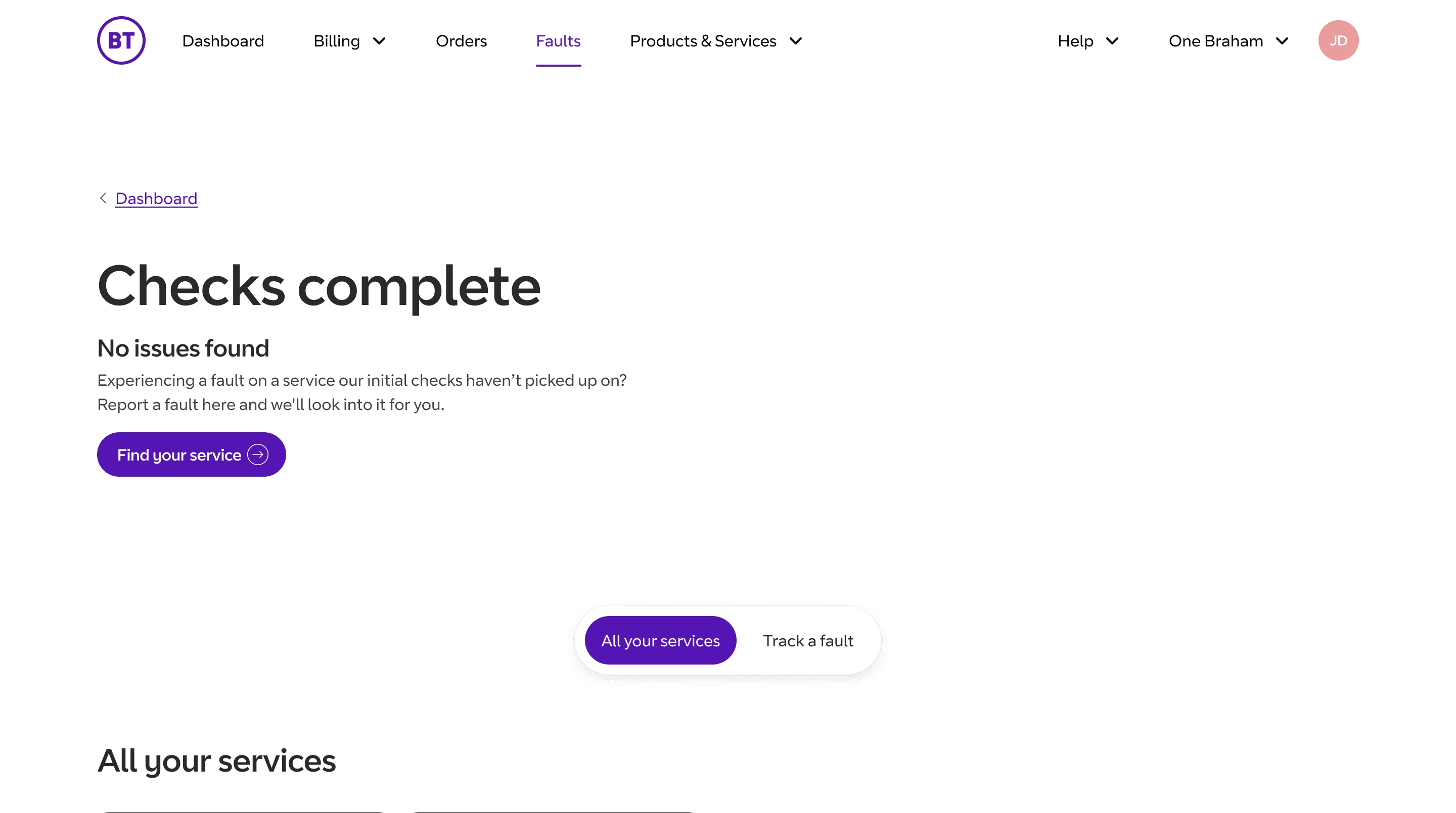
Added contextual loading states to clearly communicate each stage of the diagnostic process.
Created bespoke illustrations and animations to create a more engaging loading state.
Introduced contextual status cards using colour-coded visual cues to distinguish identified faults from services requiring further action.
Designed and added a table with advanced filtering to help users quickly locate the correct service within large accounts.
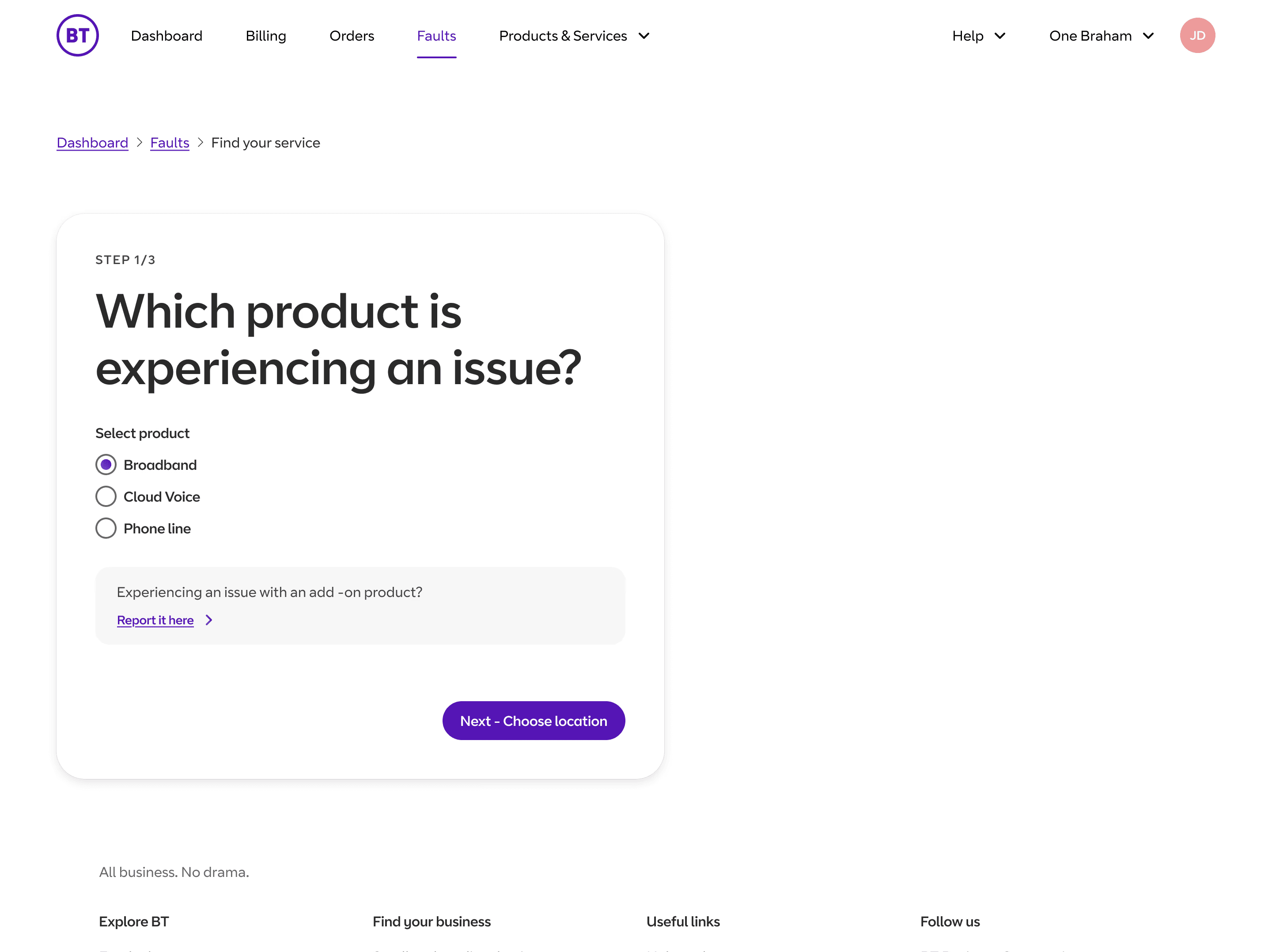
Created a guided three-step journey to help users narrow down affected services when faults couldn’t be automatically identified.

WAYS OF WORKING
92% completion rate
Users successfully completed the redesigned fault-reporting journey during usability testing.
I took a holistic, end-to-end approach, first understanding the underlying problem before moving into UI. I analysed customer analytics, call logs and session recordings, alongside usability testing through Askable, to identify friction across the journey.
These insights informed wireframing and prototyping, which I used to explore and refine solutions before testing the new experience with users. Once the UX was validated, I focused on a clean, engaging UI, introducing motion and animation to improve feedback and establish a more dynamic interaction style across My Account.


WAYS OF WORKING
I took a holistic, end-to-end approach, first understanding the underlying problem before moving into UI. I analysed customer analytics, call logs and session recordings, alongside usability testing through Askable, to identify friction across the journey.
These insights informed wireframing and prototyping, which I used to explore and refine solutions before testing the new experience with users. Once the UX was validated, I focused on a clean, engaging UI, introducing motion and animation to improve feedback and establish a more dynamic interaction style across My Account.
92% completion rate
Users successfully completed the redesigned fault-reporting journey during usability testing.
01. THE CHALLENGES
High abandonment rates during the fault reporting journey.
Pre-check loading states lacked context, leaving users unsure if diagnostics were being performed.
Lack of visual hierarchy reduced the visibility of key actions and status updates.
Users with multiple services experienced difficulty identifying the relevant service when diagnostics returned no clear fault
Most users who abandoned the online journey went on to contact a customer support agent.
02. THE APPROACH
Conducted usability testing on the live fault reporting journey to identify key pain points.
Analysed findings across pre-checks, service selection, and diagnostics.
Created low-fidelity wireframes to explore improved structure and flow.
Built interactive prototype to test the new fault reporting experience.
Ran further usability testing to test new designs and iterated based on feedback.
Handed off final designs to development with specs and guidance.
03. THE OUTCOMES
More users engaged with fault cards, leading to increased online fault reporting.
More users were able to report faults online, reducing reliance on customer support.
Added contextual loading states to clearly communicate each stage of the diagnostic process.
Created bespoke illustrations and animations to create a more engaging loading state.
Introduced contextual status cards using colour-coded visual cues to distinguish identified faults from services requiring further action.
Designed and added a table with advanced filtering to help users quickly locate the correct service within large accounts.
Created a guided three-step journey to help users narrow down affected services when faults couldn’t be automatically identified.
WAYS OF WORKING
I took a holistic, end-to-end approach, first understanding the underlying problem before moving into UI. I analysed customer analytics, call logs and session recordings, alongside usability testing through Askable, to identify friction across the journey.
These insights informed wireframing and prototyping, which I used to explore and refine solutions before testing the new experience with users. Once the UX was validated, I focused on a clean, engaging UI, introducing motion and animation to improve feedback and establish a more dynamic interaction style across My Account.
92% completion rate
Users successfully completed the redesigned fault-reporting journey during usability testing.
01. THE CHALLENGES
02. THE PROCESS
03. THE OUTCOMES