A mobile first, research-led redesign of the EE Business Mobile Deals page, focused on improving deal discoverability, reducing user drop-offs, and helping customers make informed purchasing decisions with confidence.
A mobile first, research-led redesign of the EE Business Mobile Deals page, focused on improving deal discoverability, reducing user drop-offs, and helping customers make informed purchasing decisions with confidence.
Timeline: 6 months
Timeline: 6 months
Category: Product design
Category: Product design
Project type: In-house (Full-time)
Project type: In-house (Full-time)
Techstack / Tools: Mural / Figma / UserTesting.com / Jira
Techstack / Tools: Mural / Figma / UserTesting.com / Jira
Year: 2024
Year: 2024
Timeline: 6 months
Category: Product design
Project type: In-house (Full-time)
Techstack / Tools: Mural / Figma / UserTesting.com / Jira
Year: 2024
01. THE CHALLENGES
The deals page showed high drop-off rates and low conversions compared to the general PDP.
Users were overlooking important information within deal cards.
Users misunderstood the page purpose, expecting a product bundling experience.
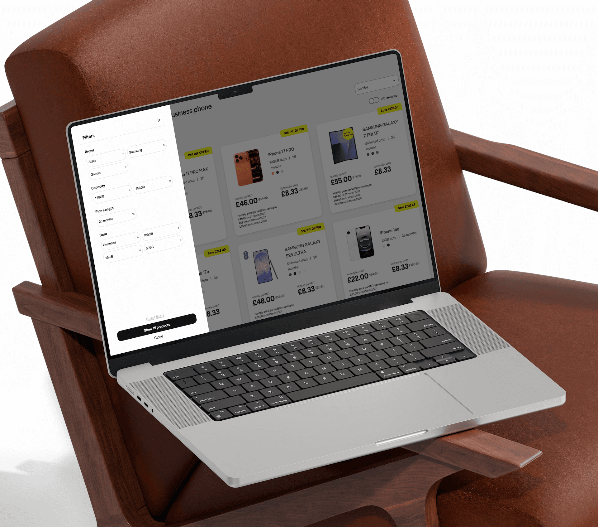
Lack of filtering made it difficult for users to quickly find relevant deals.
The entire experience was built using existing CMS components.
02. THE APPROACH
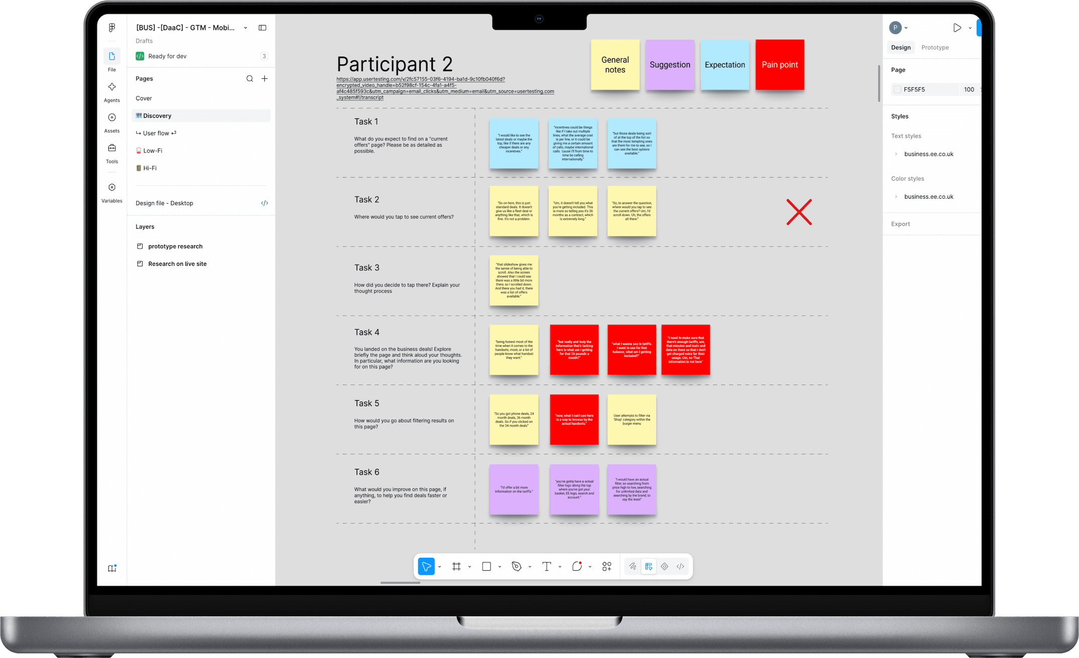
Facilitated a workshop with stakeolder to discuss pain points, CMS constraints and general next steps.
Reviewed the existing page hierarchy, cognitive load, and accessibility issues.
Conducted 10 moderated usability tests through UserTesting.com to observe user behaviour.
Designed and evaluated an A/B test that removed a major step in the journey.
Iterated low and high fidelity designs in Figma and tested them through usability testing.
Built advanced interactive prototypes using variables and conditional logic, creating realistic user flows without limiting interactions to predefined paths.

03. THE OUTCOMES
Increased conversion rates by streamlining the PDP-to-checkout funnel, helping users find and purchase products faster.
Advanced filtering was introduced after 80% of usability testing participants said they expected a way to narrow down results.
The A/B test variant achieved a 19% higher engagement rate than the original journey, validating the decision to remove a major friction point.
Accessibility improvements delivered clearer headings, consistent spacing, improved contrast, and larger tap targets across mobile devices.
Delivered a scalable redesign that improved clarity, discoverability and usability while working within existing CMS constraints.
Implemented SEO improvements that contributed to an increase in organic search impressions and increased traffic to key deals pages.
WAYS OF WORKING
60% Faster discovery
After introducing enhanced filtering
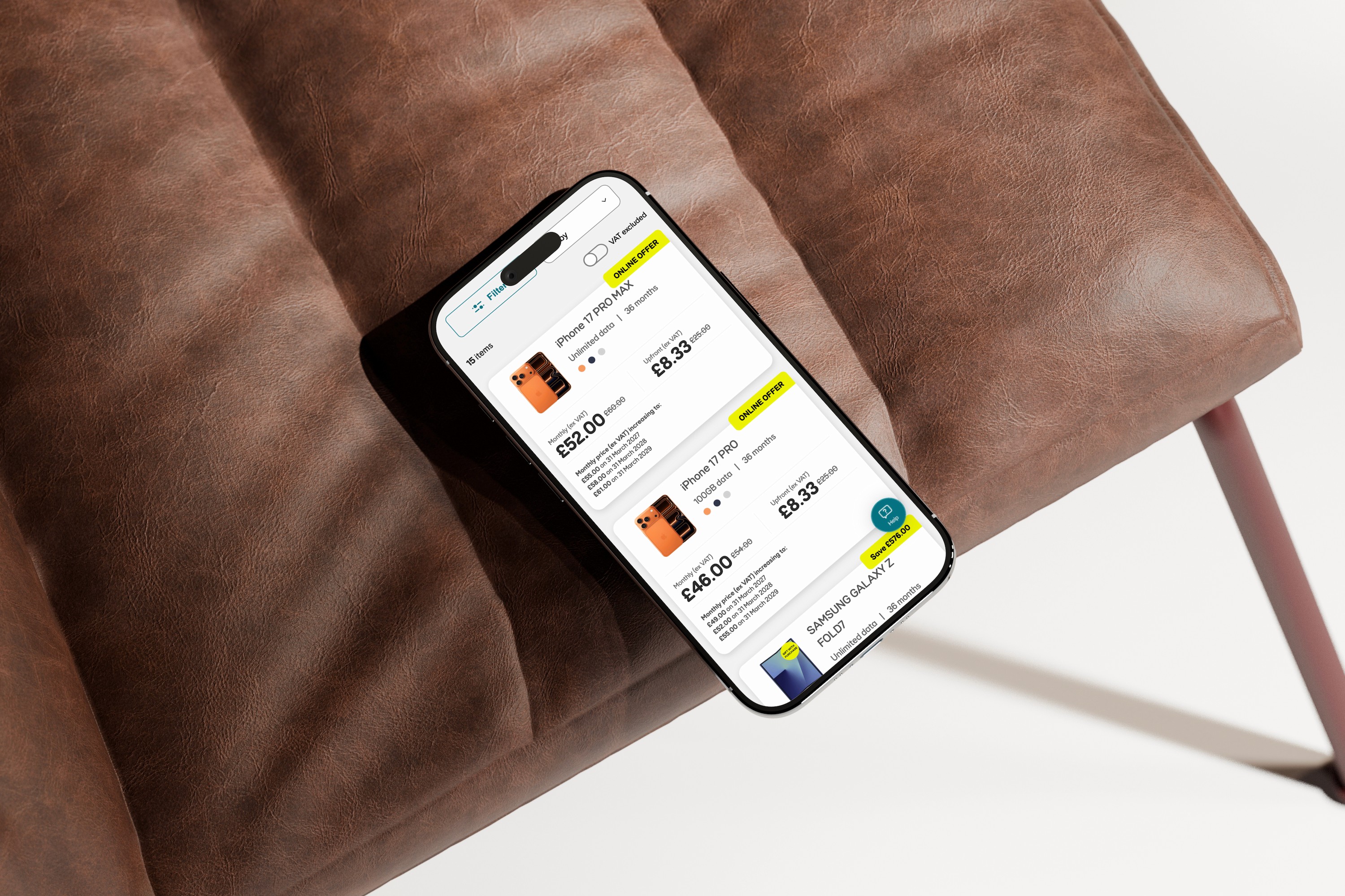
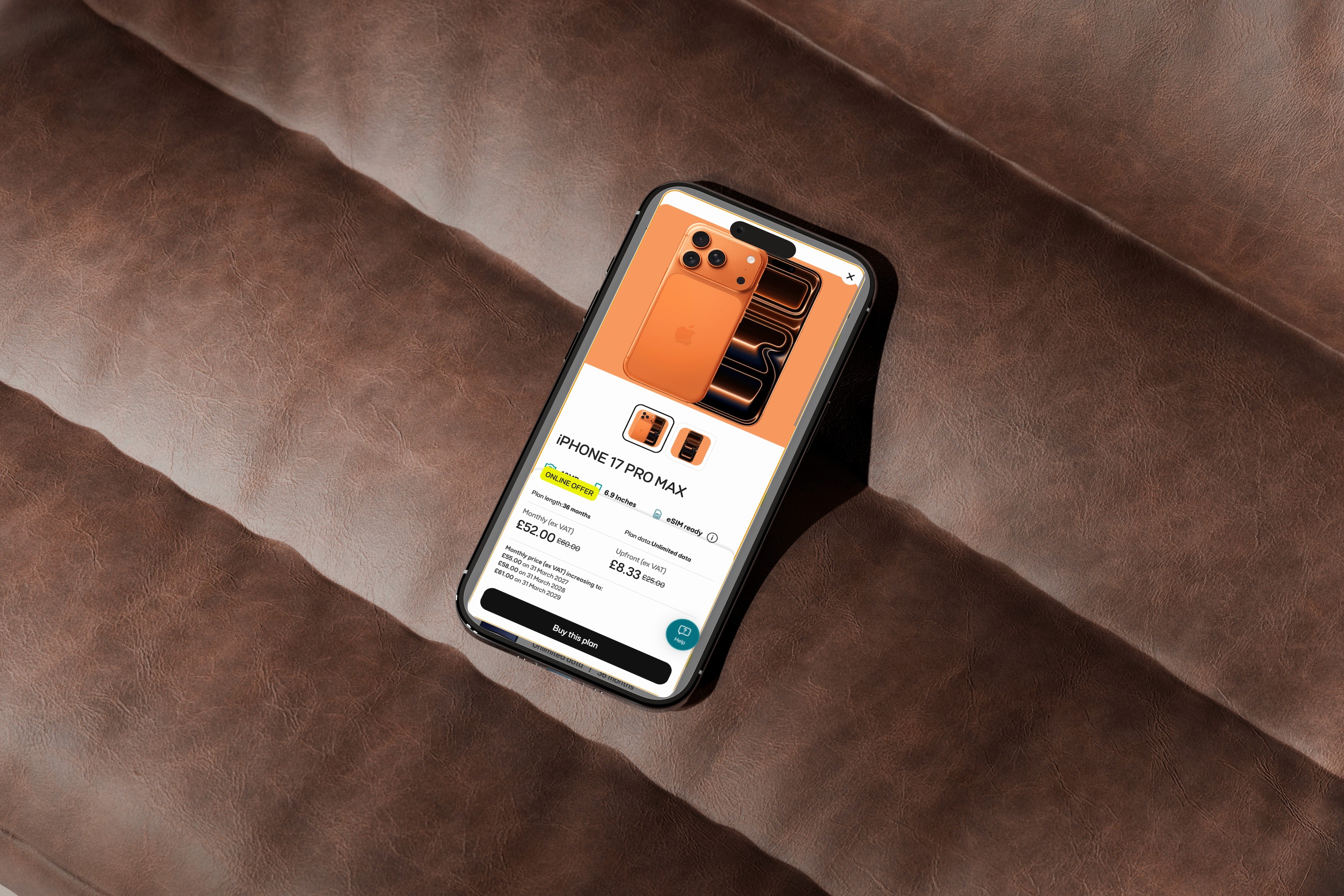
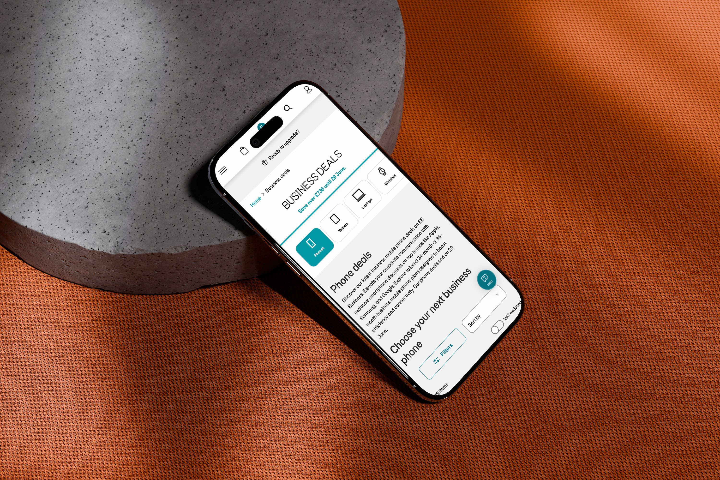
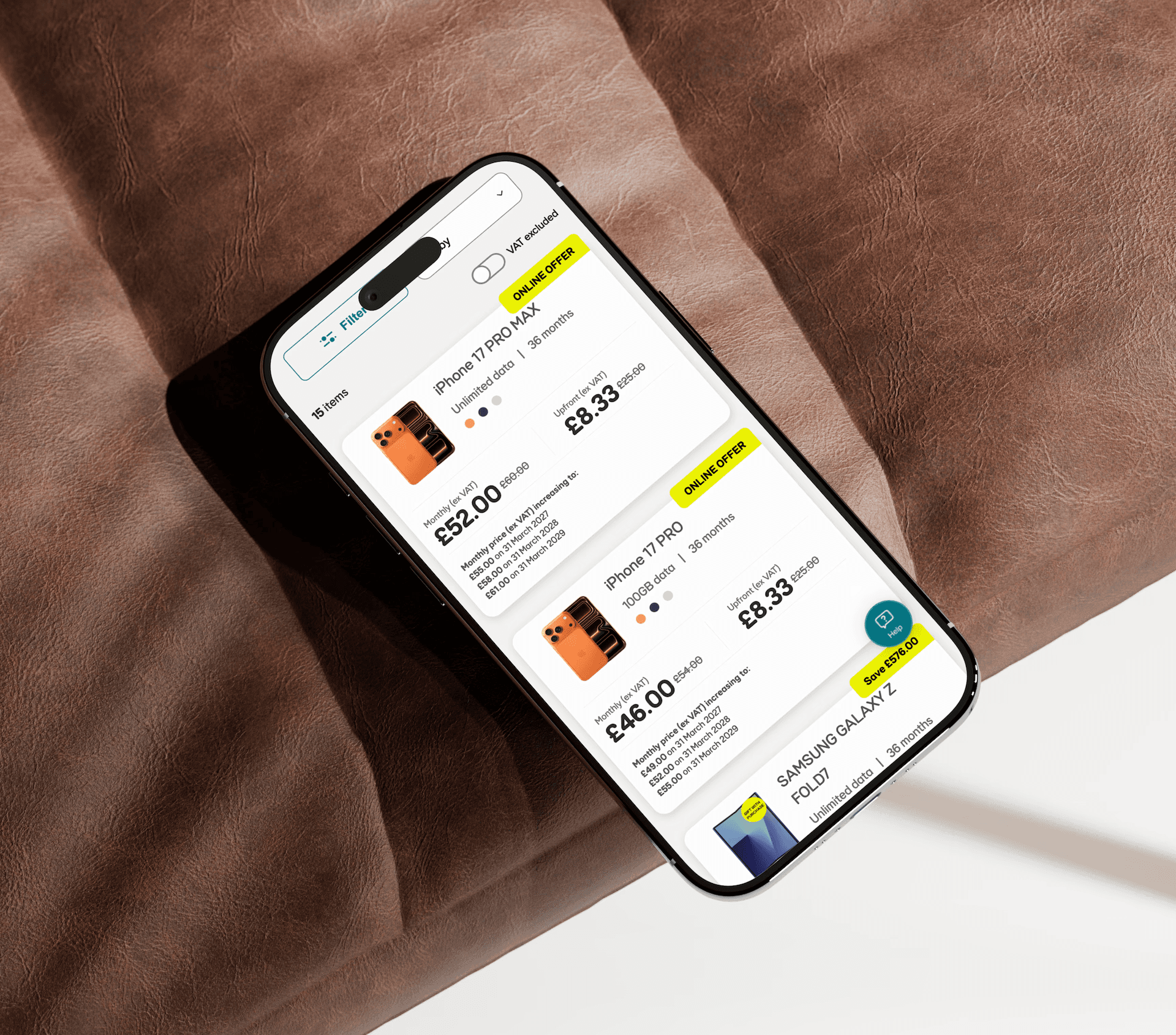
For EE Business Deals, I took a mobile-first approach, designing around the smaller screen to make key interactions and information clear from the outset. I identified accessibility improvements such as increasing touch targets, strengthening visual hierarchy and making pricing and deal information easier to understand at a glance.
I worked alongside a researcher to conduct multiple rounds of moderated usability testing and interviews, helping uncover different needs and priorities across business types. I translated these insights into actionable design outputs, creating a more user-centred and accessible experience grounded in real user needs.

WAYS OF WORKING
60% Faster discovery
After introducing enhanced filtering
For EE Business Deals, I took a mobile-first approach, designing around the smaller screen to make key interactions and information clear from the outset. I identified accessibility improvements such as increasing touch targets, strengthening visual hierarchy and making pricing and deal information easier to understand at a glance.
I worked alongside a researcher to conduct multiple rounds of moderated usability testing and interviews, helping uncover different needs and priorities across business types. I translated these insights into actionable design outputs, creating a more user-centred and accessible experience grounded in real user needs.
01. THE CHALLENGES
The deals page showed high drop-off rates and low conversions compared to the general PDP.
Users were overlooking important information within deal cards.
Users misunderstood the page purpose, expecting a product bundling experience.
Lack of filtering made it difficult for users to quickly find relevant deals.
The entire experience was built using existing CMS components.
02. THE APPROACH
Facilitated a workshop with stakeolder to discuss pain points, CMS constraints and general next steps.
Reviewed the existing page hierarchy, cognitive load, and accessibility issues.
Conducted 10 moderated usability tests through UserTesting.com to observe user behaviour.
Designed and evaluated an A/B test that removed a major step in the journey.
Iterated low and high fidelity designs in Figma and tested them through usability testing.
Built advanced interactive prototypes using variables and conditional logic, creating realistic user flows without limiting interactions to predefined paths.
03. THE OUTCOMES
Increased conversion rates by streamlining the PDP-to-checkout funnel, helping users find and purchase products faster.
Advanced filtering was introduced after 80% of usability testing participants said they expected a way to narrow down results.
The A/B test variant achieved a 19% higher engagement rate than the original journey, validating the decision to remove a major friction point.
Accessibility improvements delivered clearer headings, consistent spacing, improved contrast, and larger tap targets across mobile devices.
Delivered a scalable redesign that improved clarity, discoverability and usability while working within existing CMS constraints.
Implemented SEO improvements that contributed to an increase in organic search impressions and increased traffic to key deals pages.


WAYS OF WORKING
For EE Business Deals, I took a mobile-first approach, designing around the smaller screen to make key interactions and information clear from the outset. I identified accessibility improvements such as increasing touch targets, strengthening visual hierarchy and making pricing and deal information easier to understand at a glance.
I worked alongside a researcher to conduct multiple rounds of moderated usability testing and interviews, helping uncover different needs and priorities across business types. I translated these insights into actionable design outputs, creating a more user-centred and accessible experience grounded in real user needs.
60% Faster discovery
After introducing enhanced filtering

01. THE CHALLENGES
02. THE PROCESS
03. THE OUTCOMES